|
|
| |

Explore the Map Exercises
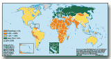
1. According to the map key, what color represents countries with lower population growth rates? Where do these countries tend to be located?
2. What color represents countries with higher population growth rates? Where do these countries tend to be located?
3.Which continent has the largest number of countries with a high PGR? What assumptions might you make about living conditions there?
4. Name and locate on the map three countries with population growth rates of more than 3 percent, three with rates of 2 to 3 percent and three with rates of less than 1 percent. To what extent are these countries typical of other countries in their regions?
Explore the Map Exercise: Print version with answers | Work on line
Home
| Site Guide | Modules | What's SD? | SD Post | Resources | About DEP| Copyright © 2000
IBRD/The World Bank |
dep@worldbank.org |